
Boduf Songs

I very rarely to pretty much never do thumbnails or comps when creating an illustration. I have no idea why I have this terrible habit, especially since 4 years of art school pretty much beats into everybody the importance of doing thumbnails and comps no matter what you’re working on. I was obviously not beaten hard enough. I still to this day tend to generate visual ideas on my brain and then brazenly pick up the pen and go for it.
However, past experience has proven that visualizing an idea and actually capturing are two very different things. Hence, the value of the thumbnail. Most of my illustrations rely heavily on photo reference, so thumbnails generally get the middle finger. But every once in a while, there is no photo reference. Photo of a fly with poor posture? Not likely. So, the thumbnail generator kicks in to try and figure out how the hell to draw a fly that slumps and hopefully looks fairly bored with the whole thing as well.
This came about when I had the privilege of creating a tour poster and had the freedom to draw whatever I’d like. This, for me, is The-Worst-Thing-That-Could-Possibly-Happen. This is because ‘freedom to draw whatever I’d like’ scares the living crap out of me. I quite like when someone specifies that they need me to draw something like a carp leaping out of a flaming cabbage, or anything else requiring specifics. I like to follow instructions.
Luckily, some weird part of my brain kicked in, and months ago I knew exactly what I wanted to draw even though I have no way of explaining why. And I thumbnailed the hell out of it. I thumbnailed while I was on the phone, while I was having coffee with a friend, even while I was at a Legendary Pink Dots show (which was quite good, I just happened to feel like drawing at the time).
And it helped a LOT. Things changed, they evolved, stuff that used to look cool suddenly didn’t seem so cool anymore. Stuff got streamlined. Things got a hell of a lot simpler. And I drew that damn fly so many times that by the time I got to the final one it was genuinely fun and familiar and he was definitely the sum of all his thumbnail parts. There is inky fly carnage all over the studio as a reminder of how I got there.
This isn’t printed yet, so it will look a bit different when it is (hopefully more gold and glinty). For now it’s a good lesson on process and patience, and a reminder that I really, really need to draw more. Especially thumbnails.
Logo Design
![]()
The past few months have been relentlessly busy, but not all of the work that I do makes for good portfolio material. If anyone out there actually enjoys reading about UI design and overhauls, by all means let me know.
A few logo designs have come through and the one displayed here is the one I was happiest with. It was one of those rare experiences where everything flowed easily from the beginning, from concept to design to color. More importantly, the client loves it and now we have begun our little “branding party”.
In a few months, you’ll hopefully notice her website added to the web corral.
night shots


mini-dirigible
 The LAB featured an art:tech show for a month, and I would have missed it if Cristian hadn’t pointed it out. The cleverest bit were 3 balloons manned by houseflies (wait, does that make it “fly”ed by houseflies? Flied? Flown?…).
They controlled the rotation of the propellors by triggering sensors connected to LEDs inside of the little domes suspended underneath.
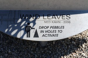
pebble chime
The “Wind Leaves” sculpture in Milwaukee.
mr. velvet head

7 July 1999 – 15 August 2010
rabduckbit

Continuing what will most likely be a short-lived theme of mythical animals, I present the “rabduckbit”. After having done research on this common optical illusion, I’m convinced that just about every illustrator out there likes to take a crack at their own version of this one. As always, I’m grateful for the continuing flood of odd but wonderful requests from my clients.
cthulhu cthocolate cthake

Created to further infuriate Erik.
You must be logged in to post a comment.