background noise

Memorial Day Vacation

The blog is quiet but it’s BUSY here. Somehow a 12 day vacation took place which felt extremely decadent but necessary. Now back in the thick of things, the desk is covered with such projects as bottle silkscreen designs, sites for iPhones, sweatband embroidery, kayak photo shoots, packaging for a soon-to-be-announced documentary, illustrations of kids with skinny legs, and a website that I’m so excited to release it makes me all a-tremble.

More on all of the above some time soon….

162 steps plus some

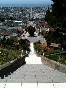
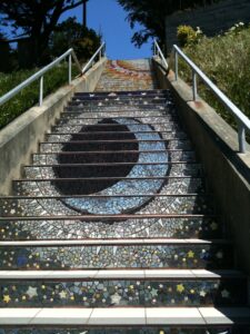
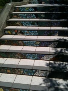
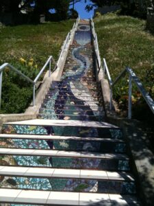
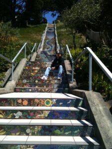
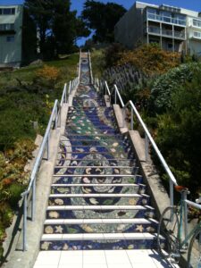
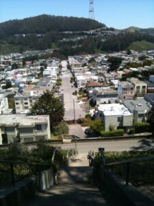
Tom visited me in Los Angeles a few years ago, and I nearly lost him after convincing him it would be a good idea to bike 14 miles across the city at 2am. For some reason he still trusts me and came to visit for the weekend. This time we took a walking approach to the city, and on the way to Golden Gate Park decided to check out the famous “162 Tiled Steps” which is exactly what it sounds like, and every bit as exhausting as you would expect 162 steps up on one side and back down the other would be (especially when carrying one’s bike and a 10lb lock).

BOB Festival

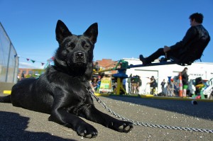
Zoca, doing a crappy job supervising the Whirl And HurlWe spent Sunday the 24th in blazing April heat in the parking lot of the amazing Linden Street Brewery as a part of BOB Festival. It was a day of all my worlds converging as friends’ bands performed, polo teammates and Derailleur folks showed up, and I was happily on the work crew for Cyclecide that day. It was the last day of a week long music festival, so most folks were pooped but there was still a healthy amount of chaos and injuries.
Photostream from The Scourge.

New Headquarters

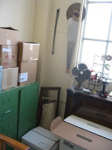
office carnageAfter a few false starts, Aponeurotica Design finally has a new office to call home. Or, more accurately, it’s a new place to call “work”. My commute is finally longer than 5 feet and takes me to a warehouse in the Bayview which was originally a mattress factory back in 1904. I am separated by French doors from the rest of the studio occupied by a painter and a sculptor, and am overlooking train tracks and hillsides peppered with houses.

For those of you who visited my last studio space, I assure you this one is not only warmer (how could it not be?) but this one also allows such fantastical activities as lifting your arms up away from your sides without crashing into anything.

The boxes are nearly unpacked and the French press is rocking, so if you’re in the neighborhood come say ahoy hoy:
1777 Yosemite Avenue
Suite 230
San Francisco, CA 94124

Updated 11 Oct:
A sad departure from Yosemite, as that warehouse was spectacular and full of artists whom I love and already miss. Aponeurotica has now relocated in a much more permanent way to the East Bay, and is enjoying sunshine & walnuts.

Fluid Layouts

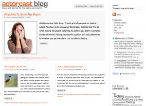
ActorCastBlog screenshotEvery WordPress template has its hidden challenges and it’s usually the challenges that make them enjoyable and worthwhile. Paradoxically, the better you meet the challenges the more invisible they are to the web users.

When I put a sketch together for ActorCast, I even tricked myself into thinking I had created a clean layout for a simple template solution. It was only when I tried to tackle the magazine-style layout that featured the most recent article in a feed for the home page that things turned ugly.

Starting with my secret weapon Thematic, I began the process of branding and customization. Along the way, a wave of insanity struck me and I realized the design was a perfect candidate for programming a fluid layout which I had wanted to attempt for ages. This means that dimensions for all elements are established in percentages instead of pixels or ems. This means that your brain begins to fall out when you have to account for fluid divs that need to stack. The payoff is a layout that still has adequate white space to soothe the eye, but will accommodate a screen of any size instead of looking shrimpy on a large screen and bloated on a laptop.

The magazine layout required PHP on a level I had never attempted before. The final function sheet grabs the most recent post from the database and slaps custom CSS tags on it to display all of its elements at a more prominent size and style for all elements within. This seems easy until you consider that the featured image in this area is receiving unique size conditions, and having a featured post that looks like it spans two columns requires an odd number of posts for the feed on the home page. All other pages have even numbers of posts. Genius friends Patrick and Dave helped push me in the right direction to get all of the code working.

Even with all of those kinks worked out, final details to make the fluid post divs stack correctly had to be dealt with because post excerpts differ in length and thereby change the height of all the post divs. After all of the PHP and CSS is applied, one last step in the DOM script is put in place by good old jQuery to set simple “clear:left;”s on the odd posts to make it all work. jQuery has become my 11th hour savior when things get weird and my PHP and CSS skills have hit a wall.

Final result is a site that looks clean, and simple, and runs on code that I’m really proud of writing. No one can really see it, but I know it’s in there. And most importantly, the client likes it.
ActorCastBlog.net

heavy metal cake

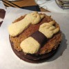
jager cake, prior to delivery, featuring chocolate cake sweat bandheavy metal cake suffering from dislocated hail-satan-pinkyThe newest addition to the growing gallery of unusual cakes that erupt in my studio from time to time. This one was inspired by a few of my favorite things: german chocolate cake, anatomical sculpture, and Jägermeister. I even got to deliver it by bike (which also caused one dislocated “hail satan” pinky but that’s okay).


Karma Travel Thematic Child Theme

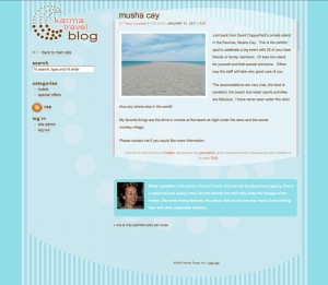
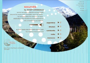
Karma Travel WordPress Site Karma Travel Flash Site

I created a Flash-based site for Karma Travel a couple years ago, and they re-hired me to design a WordPress template so that they could blog about their services as well. I’ve been busy working on a lot of child themes lately, but I particularly enjoyed this one because of its quirky challenges and ease with which it came together.

When I get hired to create a WP templates, I do the wireframing, design and coding, so you would think I’d be a little more savvy about proposing designs without major php challenges. Some evil part of me always manages to create designs that are just a little beyond my coding skills, so every template offers its own learning curve and share of profanities.

Some items that are now a solid part of my toolbox: sticky footers, oddly shaped content framing, playing with WP3’s featured image functionality, and finally taking advantage of author blurbs.