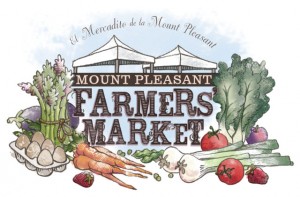
 This logo is about 8 months in the making, but in the end both the client and I are really happy with it. It will still get some spit polishing here and there over the next few months, but at least they can get the 2010 farmer’s market season in Washington, D.C. off to a more branded, stylish start.
I have an entire sketch pad filled with rejected vegetable drawings which might not sound impressive unless you are familiar with just how small I draw. Over the course of the project, I learned that apples are nearly impossible to anatomically duplicate (hence, it was quietly replaced by a plum), and asparagus is a hell of a lot of fun to draw. It has a “whee” factor.
Mt. Pleasant Farmer’s Market
You must be logged in to post a comment.